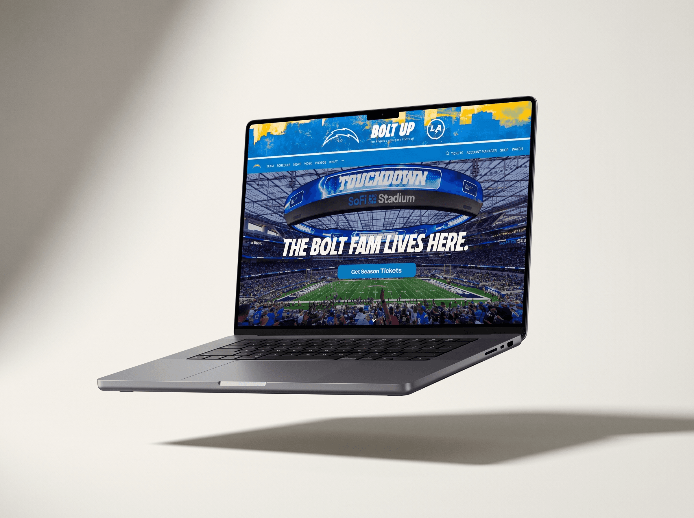
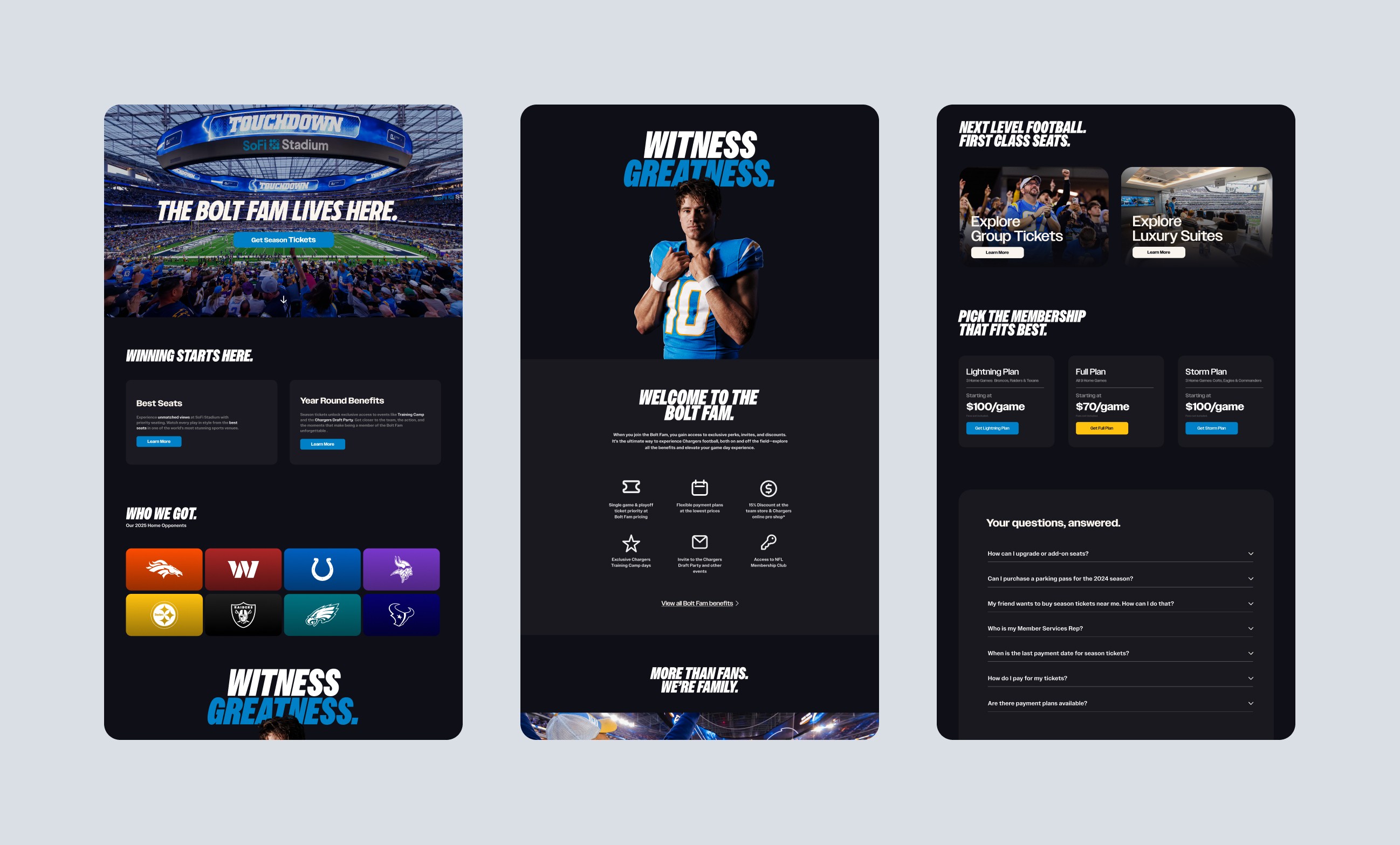
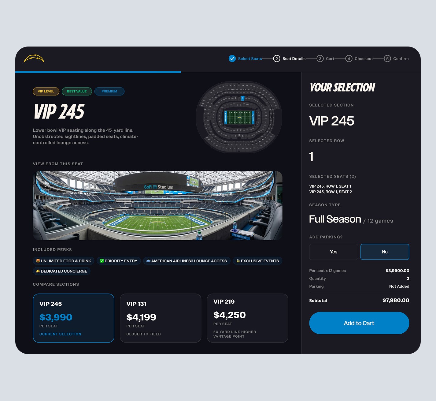
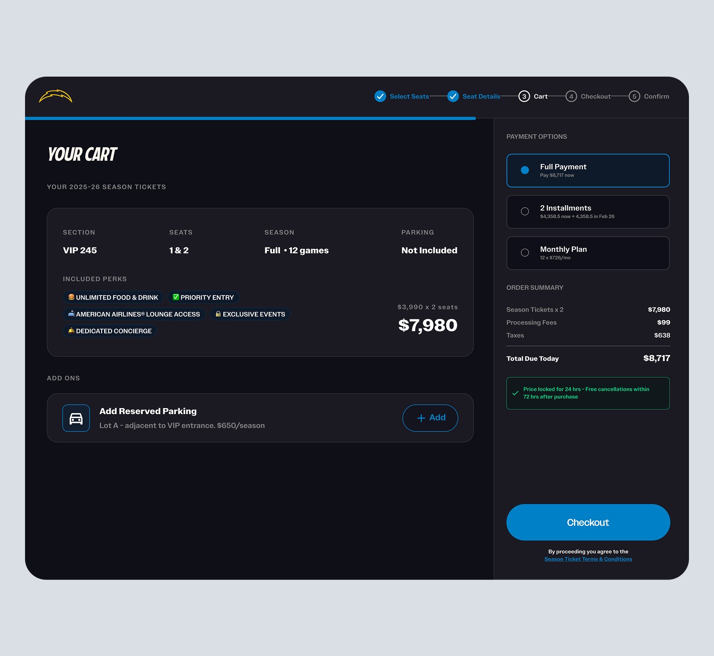
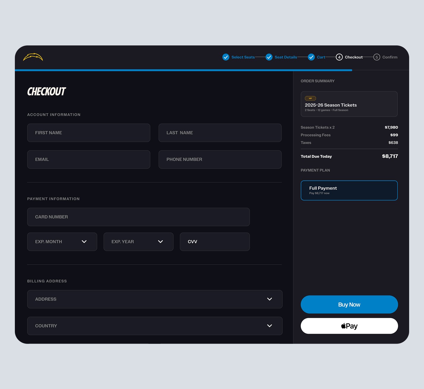
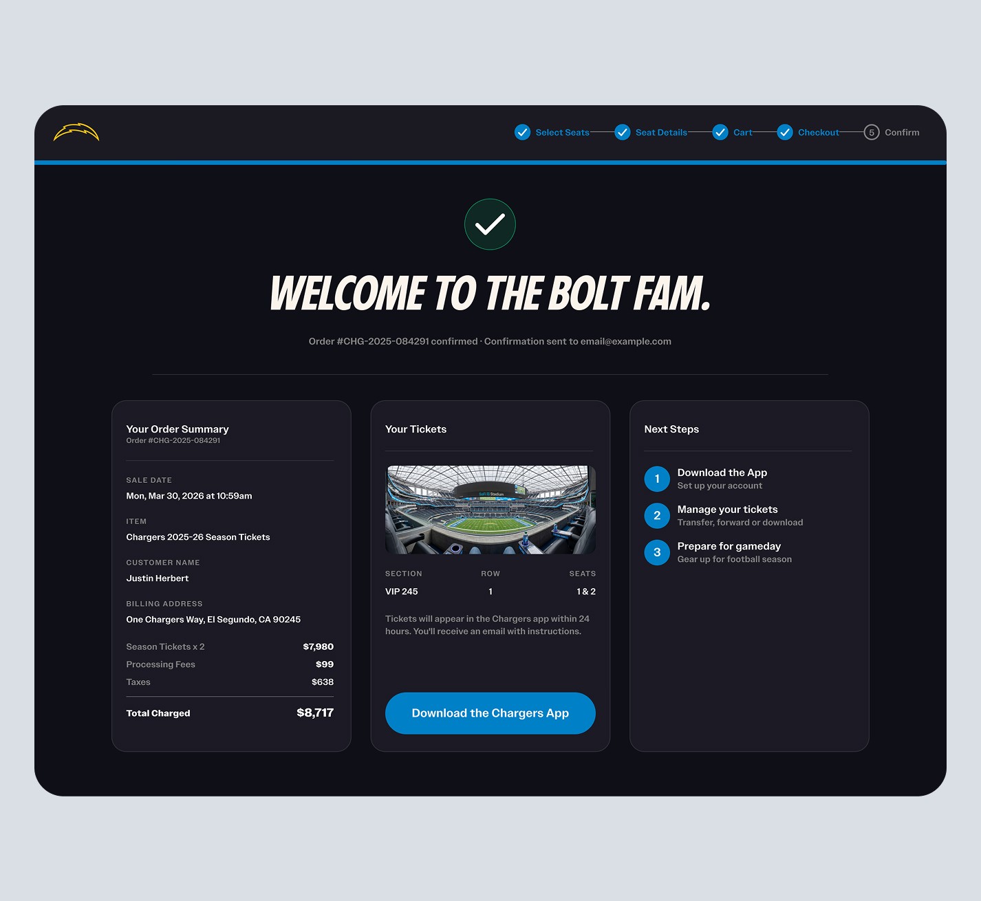
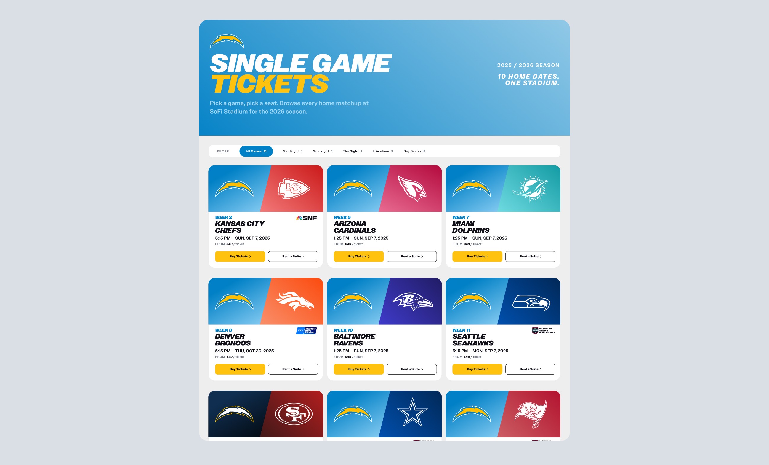
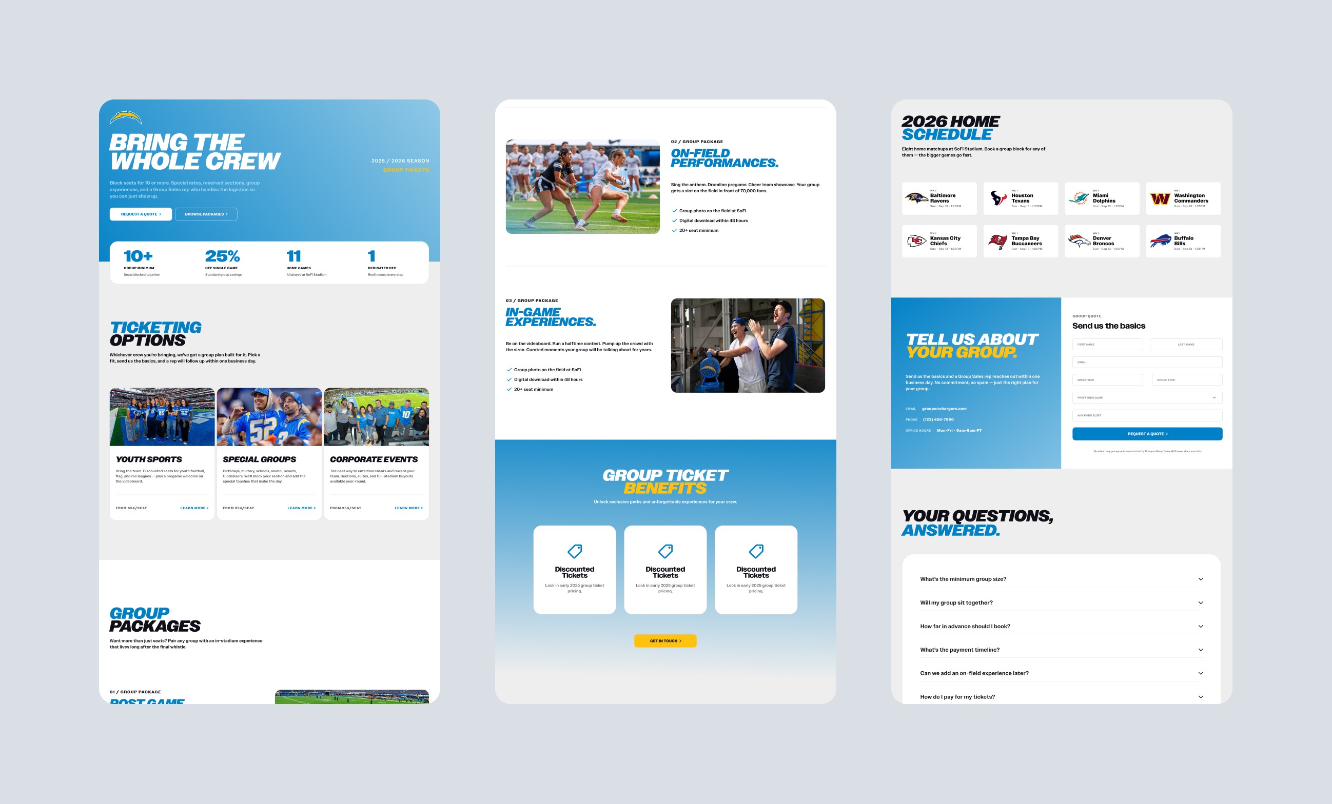
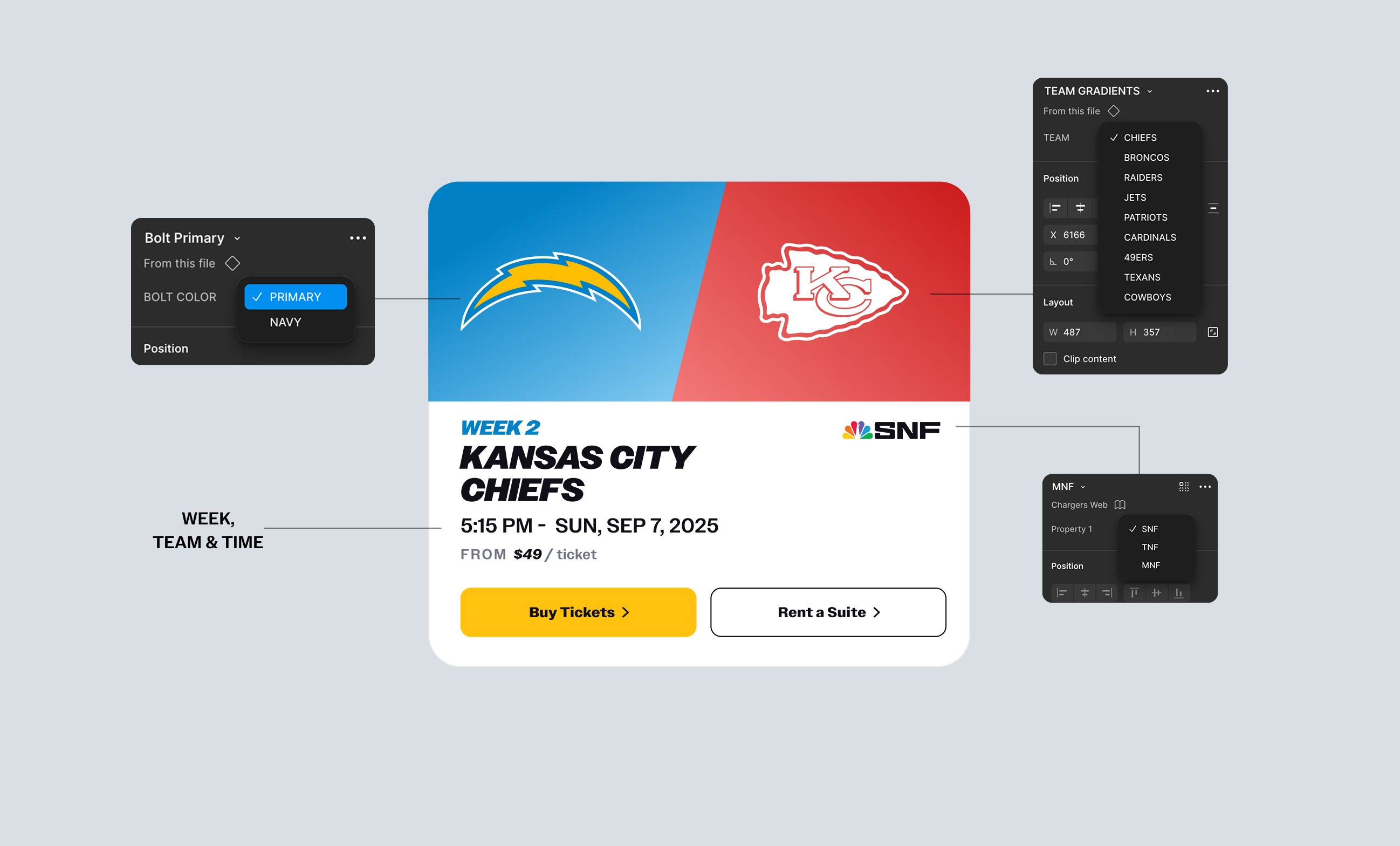
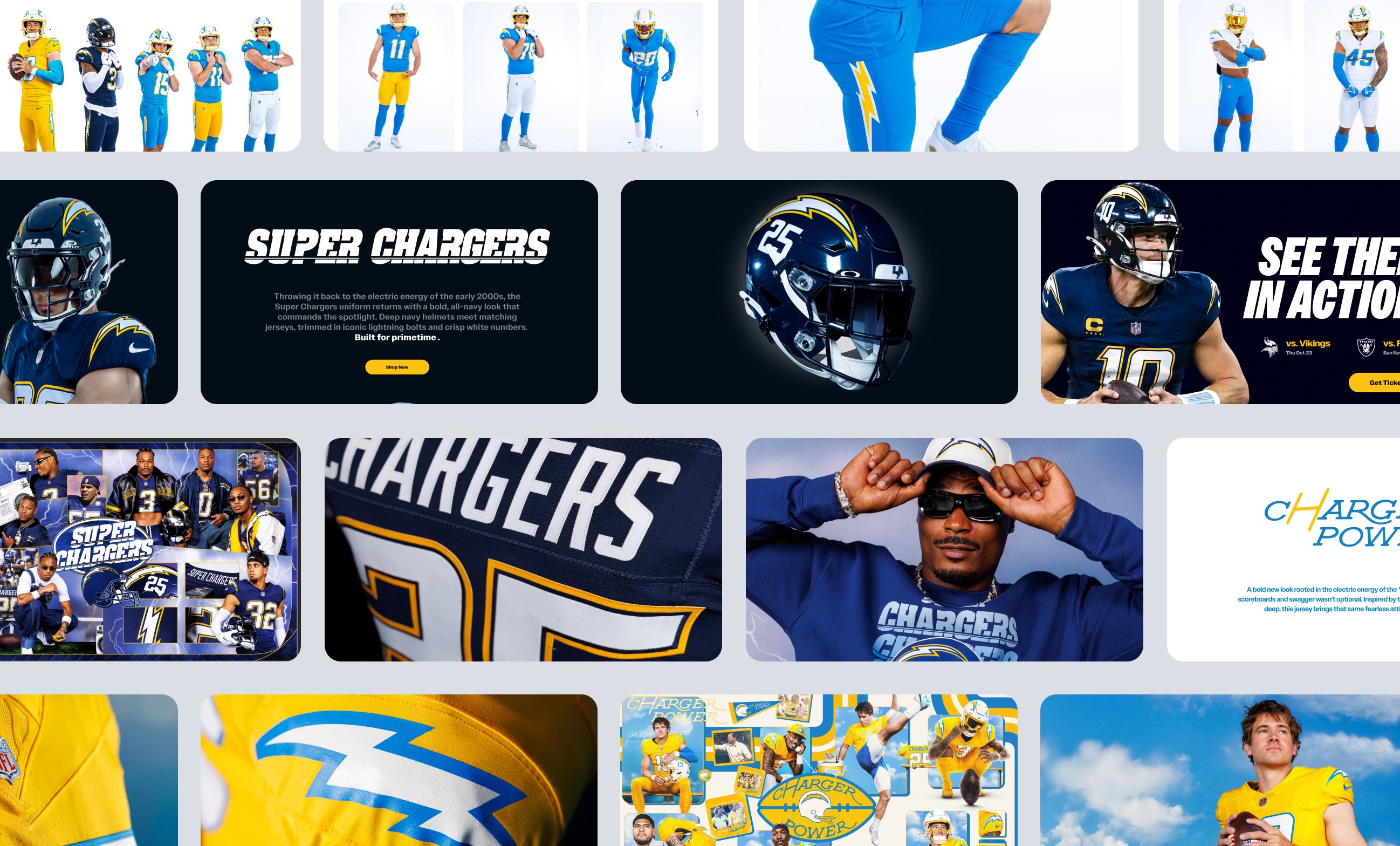
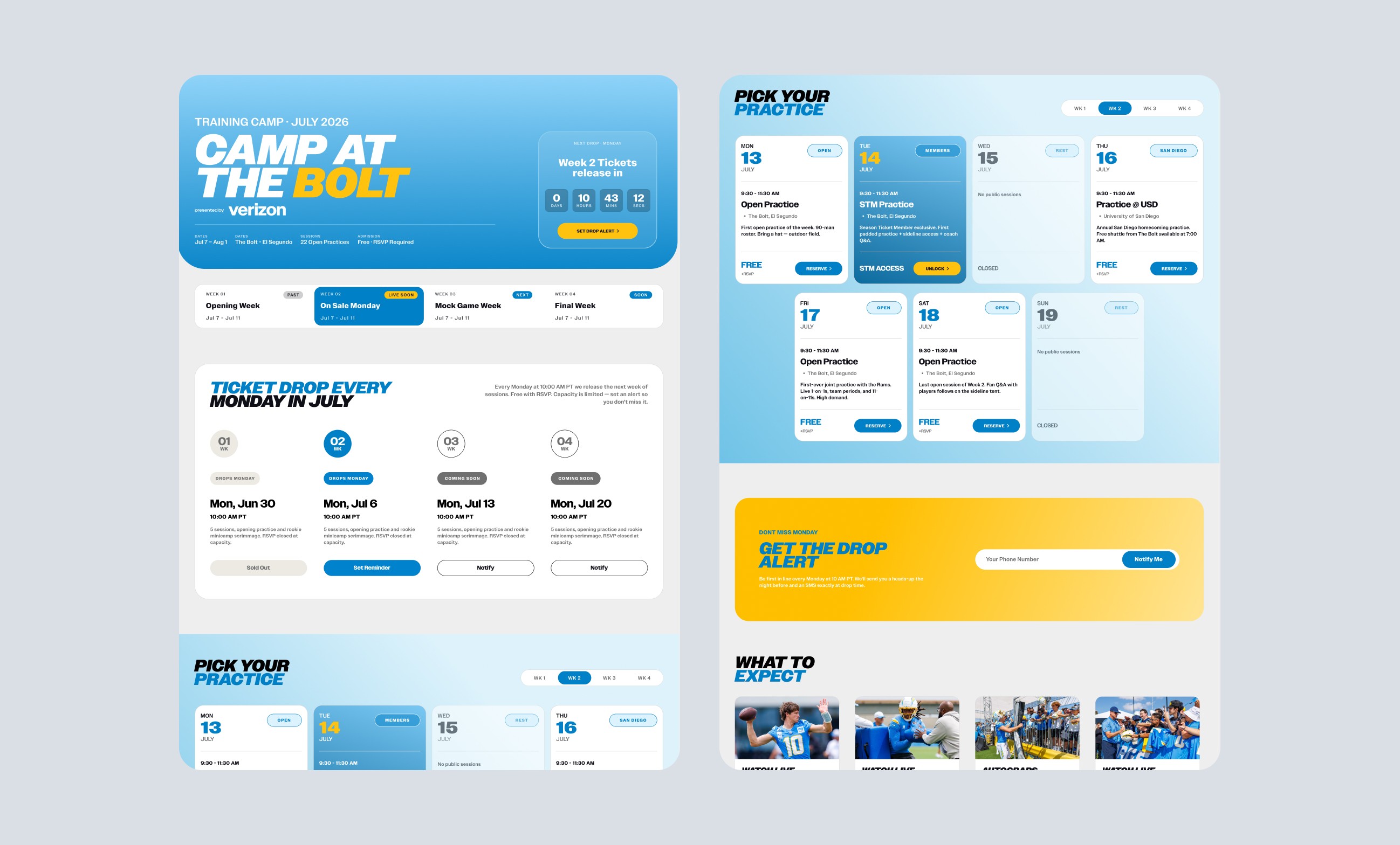
Across major launches, ticket pages, fan guides, and event experiences, the Chargers website had to carry a lot without feeling cluttered. The work brought campaign energy into a more structured digital system, creating pages that felt premium, easy to move through, and built for fans trying to get to the good stuff fast.
Mapped the full ticketing journey from landing page to checkout to identify friction points and unnecessary steps.
Simplify Structure
Simplify Structure
Reworked information hierarchy to make pricing, seat options, and CTAs easier to scan and compare.
Reworked information hierarchy to make pricing, seat options, and CTAs easier to scan and compare.
Design Key Screens
Design Key Screens
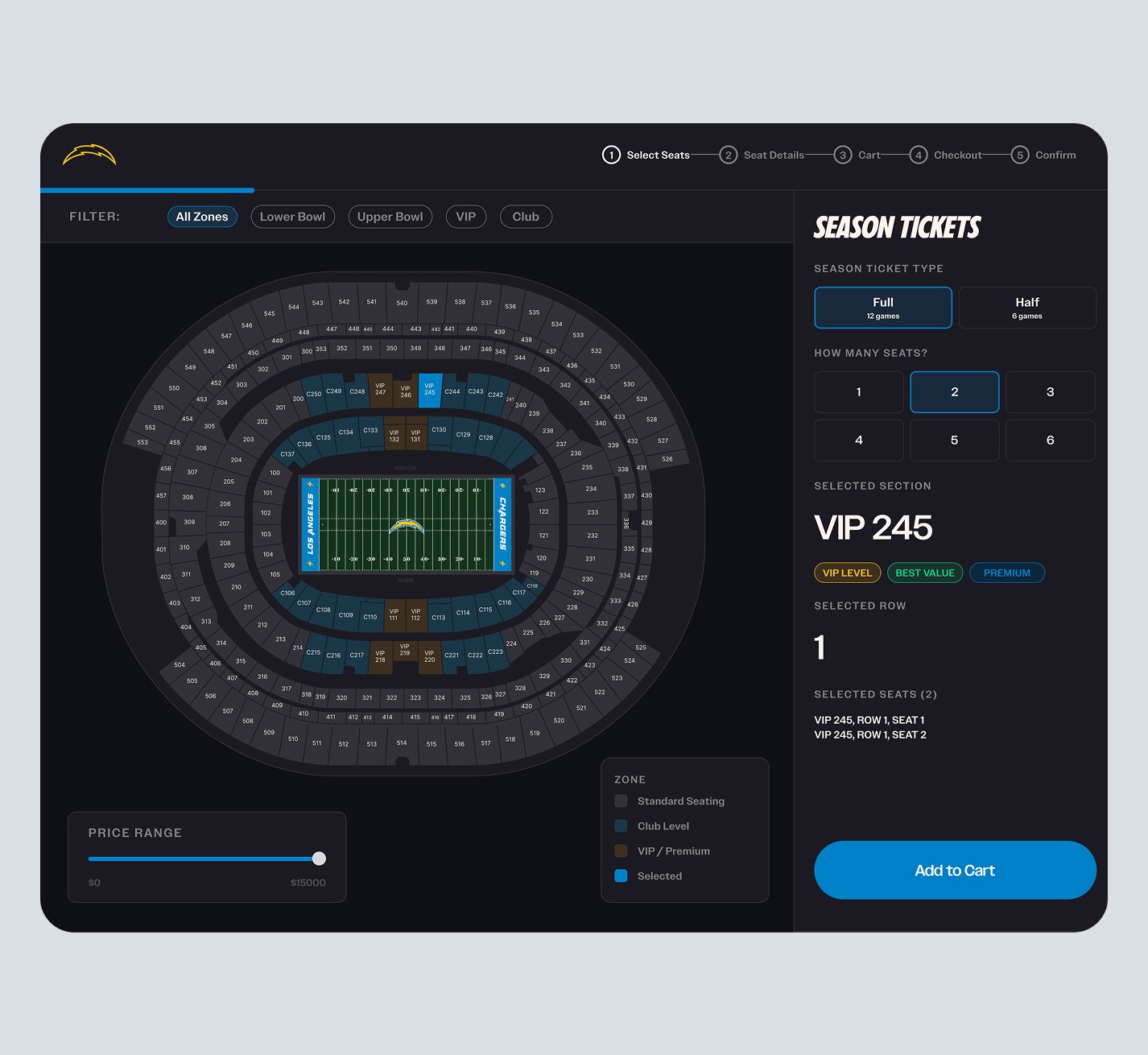
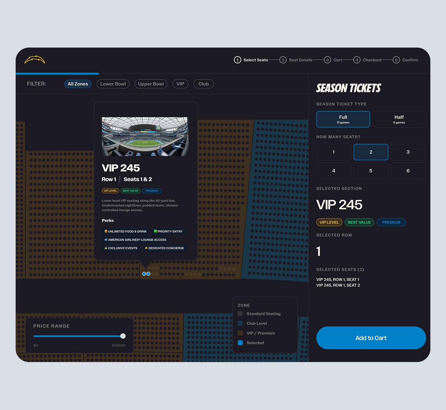
Created focused UI for landing, seat selection, and checkout with an emphasis on speed and clarity.
Created focused UI for landing, seat selection, and checkout with an emphasis on speed and clarity.
Iterate for Speed
Iterate for Speed
Refined layouts for mobile, reduced input friction, and optimized flows for high-intent, time-sensitive users.
Refined layouts for mobile, reduced input friction, and optimized flows for high-intent, time-sensitive users.
Season Tickets
Refined layouts for mobile, reduced input friction, and optimized flows for high-intent, time-sensitive users.
Ticketing Experience
Specialty Campaign Pages
Designing for Scale and Speed
Working on the Los Angeles Chargers digital ecosystem taught me how to design for high-traffic moments, competing business priorities, and passionate users. Whether optimizing ticket purchase flows or launching major campaign pages, the goal was always the same: create clear, engaging experiences that help fans take action quickly and confidently.